Project: The Alb ny Rebranding
Creative Director: Dexter Nguyen
Visual Marketing & CGI: 4pixos Studio
This is the demo that shows 4pixos Studio's ability as a Real Estate Creative Agency. We chose an existing project at Thao Dien, and gave it a whole new look, from positioning and art direction to interior design, editorial design, concept and CGI. The final products include a brochure, floorplan, website, and marketing images.
From what is shown in this project, it is the most convincing demonstration of the capacity and work ethic of 4pixos Studio. That is perfectionism, a love of beauty, attention to detail, and meticulousness in all aspects in order to create the best products.


In terms of visual marketing, there is no apparent differentiation between high-end and mid-end real estate product lines in the Vietnamese real estate market. The Alb ny consistently promotes exclusivity, class, and luxury, but the picture is completely distorted. Therefore, we decided to gather our team of creative director, graphic designer, interior designer, archviz artist, and photographer and do a rebranding. Something very high-end, something that aligned with the positioning of this project and its developers, "prime luxury boutique".
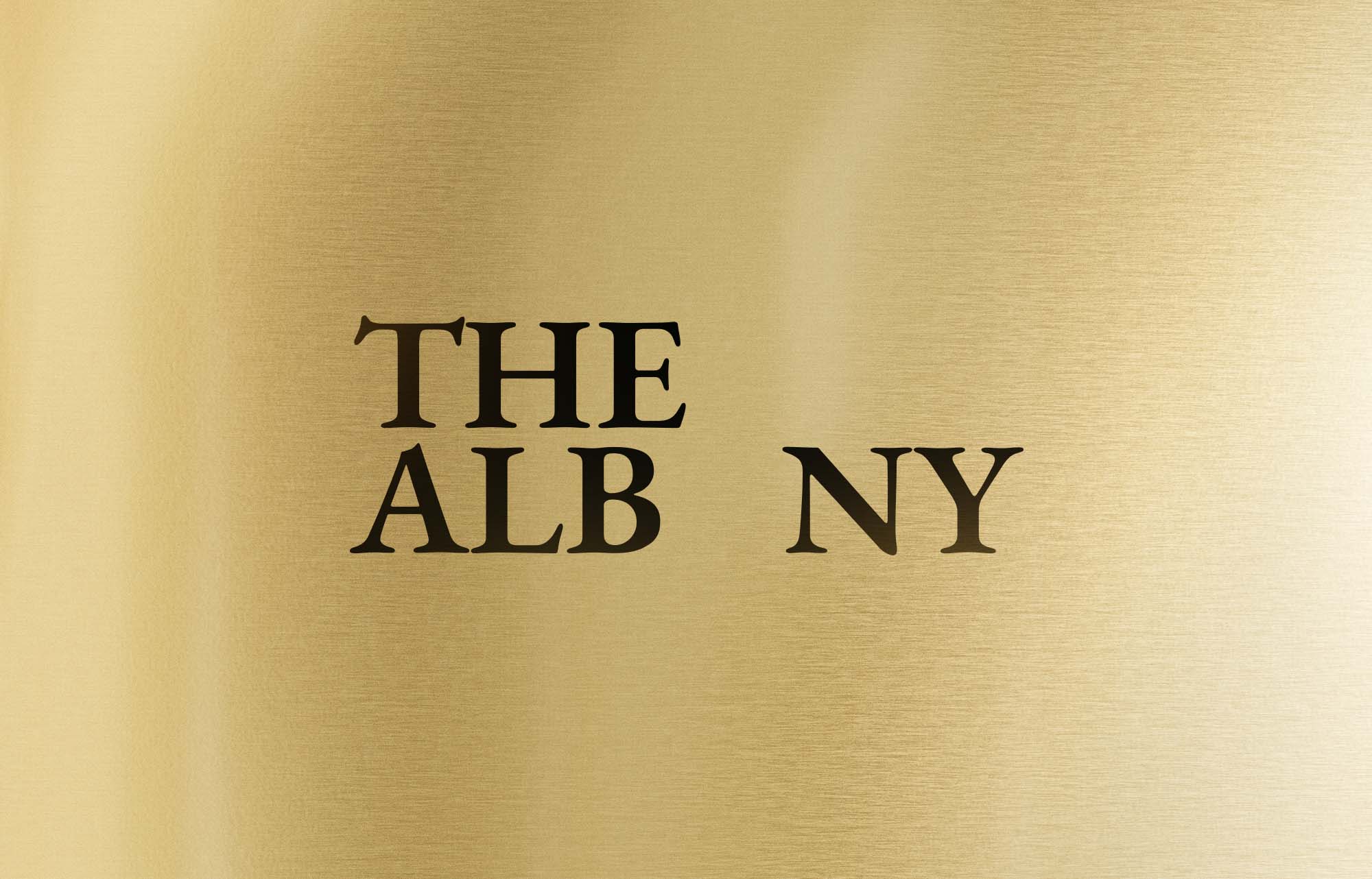
The level of The Alb ny project is realized by 4pixos Studio through visual reconstruction and a thorough approach. The main concept to affirm Another Class of The Alb ny, compared to other projects. After a lot of research and brainstorming, we came up with 4 key ideas: Elite Community, Global Standards, Exclusive Privacy and Stylish Details.
Through typefaces, colors, materials, brochure, website, CGI, and other means, the visual identity portrays the upper class's luxury, and refinement, conveying the profound meaning of "Another Class". We've converted them into a distinctive visual language that will serve as the cornerstone for communication and marketing campaigns.


The color scheme of the brochure concentrates on neutral tones, which can convey the elegance, refinement, and sophistication of a higher social level. These colors are also appropriate for The Alb ny's space and interior; the colors of the primary material represent the ultimate design. To create the impression of an elite and sophisticated class, the main colors are used throughout and synchronously, not only in interiors and architectural spaces, but also in media publications such as brochure, website,...
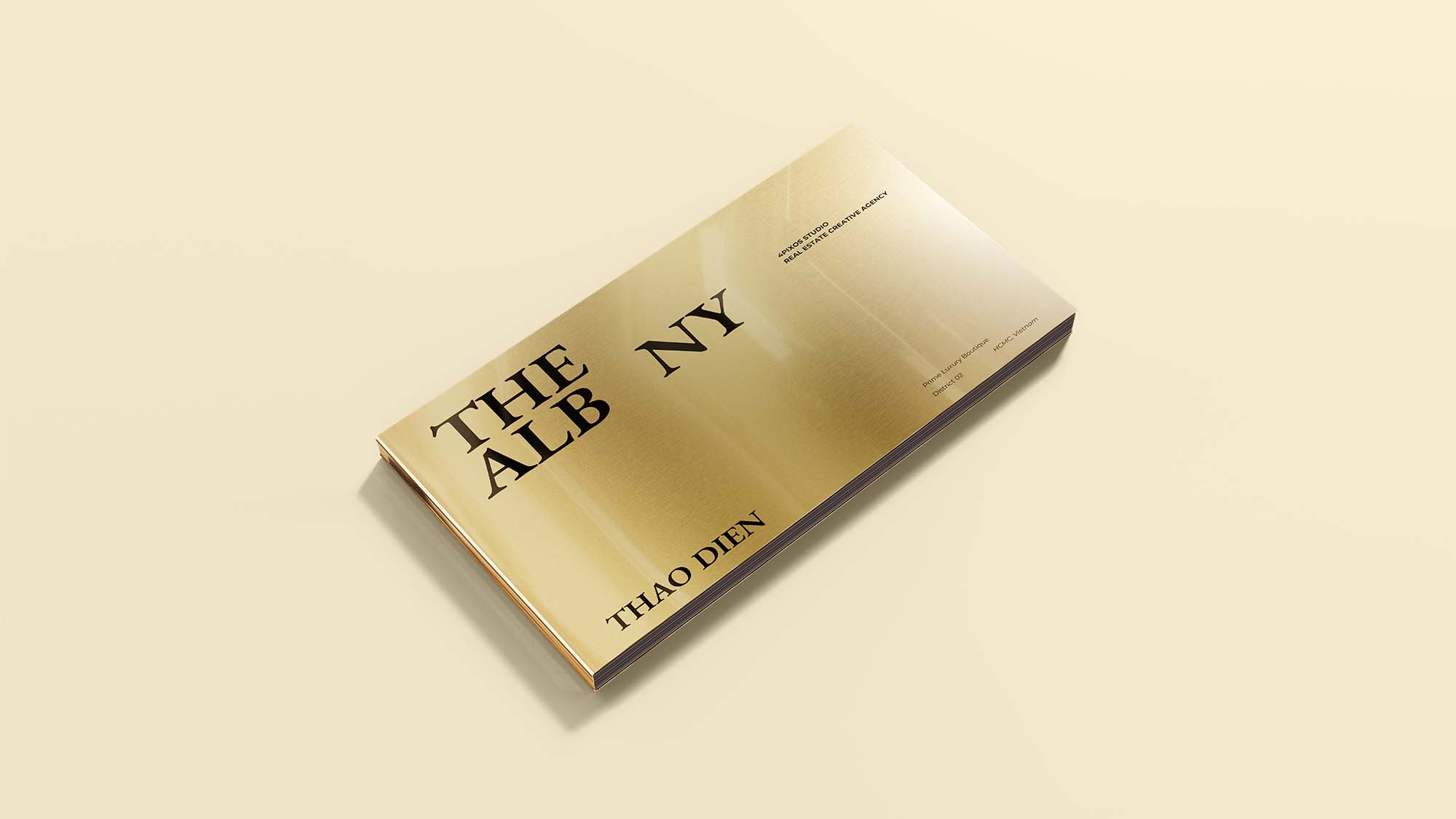


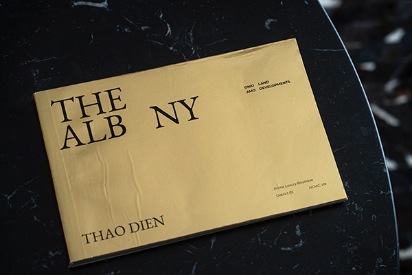


To convey the notion of Another Class, the cover of the brochure is printed on high-quality gilded paper, representing the spirit of the elite and delivering a unique and sophisticated experience. The grid system of the brochure is inspired and implemented the golden ratio principle to aid the layout system always ensure uniqueness, internationality, and high class, in order to express the international standard and distinctive aspect of the Another Class concept.

Website layout should always reflect Brand Identity and be consistent with other elements of the Brand Strategy, as expressed through fonts, colors, content,...


.png)
.png)
%20FINAL.jpg)